Juntos Global
A conversation tool to help banks build relationships with their customers
Juntos helps banks build relationships with their customers through automated conversations. As the main product designer, I designed a new product end to end, from research and user testing to final designs, so banks could create conversations and see exactly what their customers would receive. I tested it in English and Spanish across two rounds.
- Role
- Main product designer
- Worked with
- Product manager and head of development, operations manager, engineers
- Platform
- Web, in English and Spanish
- Focus
- B2B fintech
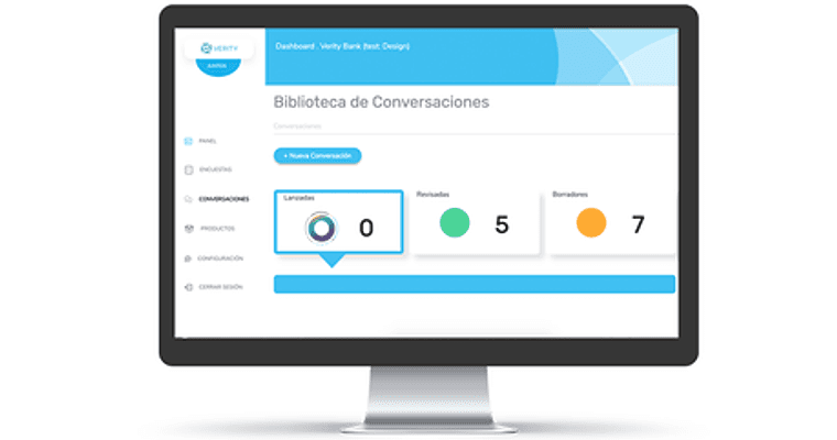
The goal
After years of developing the initial product, Juntos knew their clients' customers' needs to the core. They needed a cost-effective way for banks to see the power of their algorithm.
My role
As the main product designer, I worked on every part of the new design: UX research, user testing, sketching, low- and mid-fidelity wireframes, and final designs.
Research
To understand the banks and their customers, I reviewed interviews the company had done while testing a basic wireframe prototype. I also spoke with a customer expert, who walked me through users' needs and challenges in detail.
Understanding the users
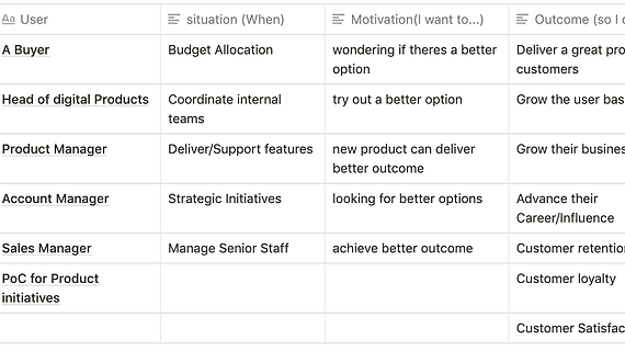
The company had a few personas. For a more rounded picture, I ran a User / Situation / Motivation / Outcome exercise.
How banks move through the app
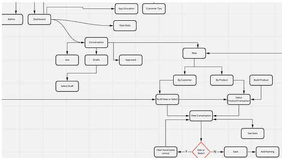
The key question was how people would want to build a conversation. Some would start by creating the conversation, others by choosing a product.
The first flows saved the conversation at the end. Working closely with engineering, I learned it needed to happen earlier to work reliably. I also wanted conversations to be easy to change, which the backend couldn't easily support.
Working with the team
I worked closely with the product manager and head of development, and the operations manager, who had done the initial concept testing. I also worked with the engineers throughout development.
Testing and evolving the design
The two most important pages were selecting the topics and viewing the conversation customers would receive. I ran two rounds of testing, one internal and one external, in both Spanish and English, since the product serves markets in several countries.
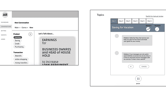
Early iteration
- ✓Clear which topic people were working on
- ✗The button interaction was too long for the page
- ✗People needed to see all the conversation topics at once
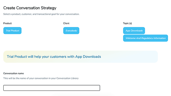
Final conversation selector
- ✓Select topics and clients easily
- ✓See the overall goal of the conversation
- ✓Save the conversation
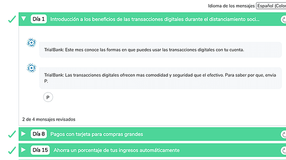
Final message viewer
- ✓Read every conversation topic
- ✓See each conversation and how many messages are left
- ✓Switch languages
- ✓Know when each conversation has been reviewed
Accessible colours
After development, I researched colours for the clients' graphs, which needed more than 20 distinct colours.
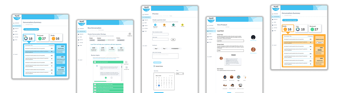
Final designs
Learnings
- A few parts of the design were misread by engineering. Next time I'd walk the whole development team through the designs, not just one person.